Case Study: Barbara’s
Natural & organic doesn’t have to be boring.
Redefining a classic brand’s voice for the next generation of buyers.
The Issue
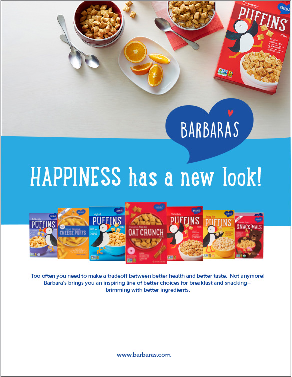
In early 2019, Barbara’s had just completed a packaging update to their full line of products. They came to Spyglass to develop the full Barbara’s brand that complemented the new packaging design – and then bring it to life on the web.
The Insight
While most brands in the Natural & Organic Category focused on the healthy aspects of their products, there was a void for moms who wanted their kids to eat healthier food, but knew that they could be a tough sell. Could cereal and snacks be both healthy AND fun? There was an opportunity to change that perception.
The Solution
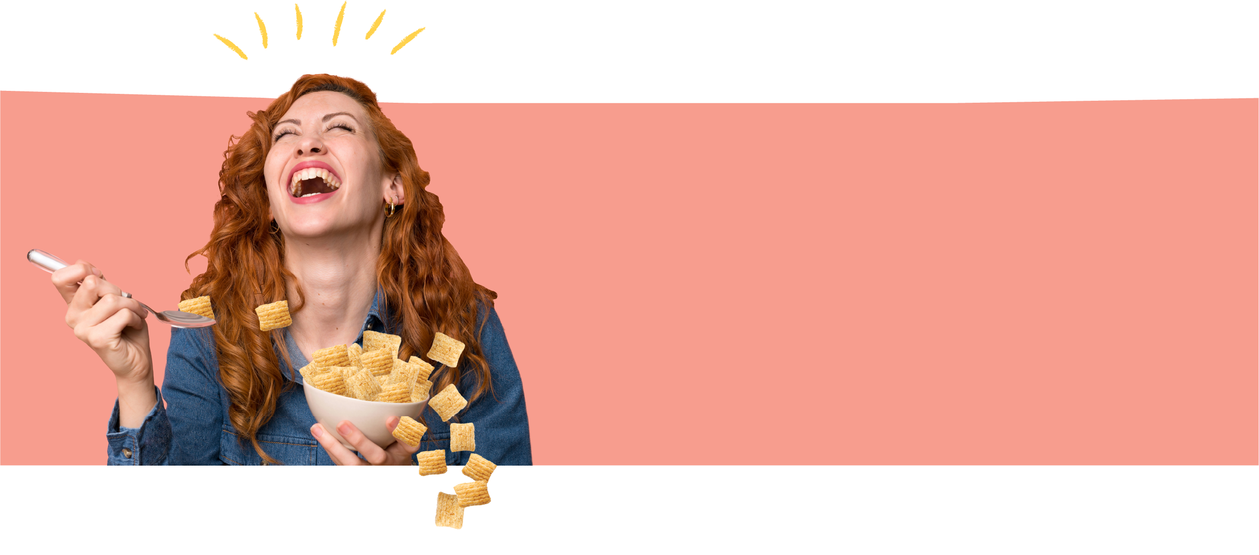
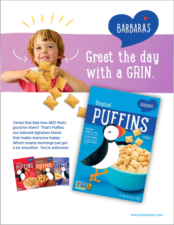
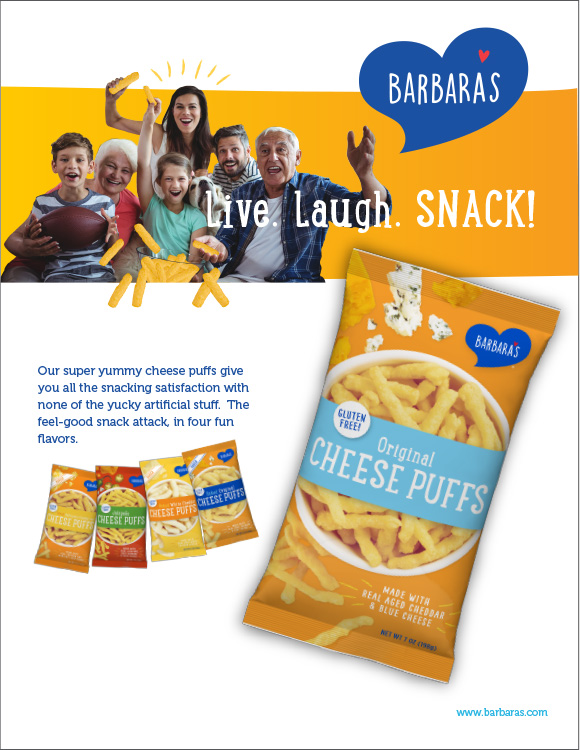
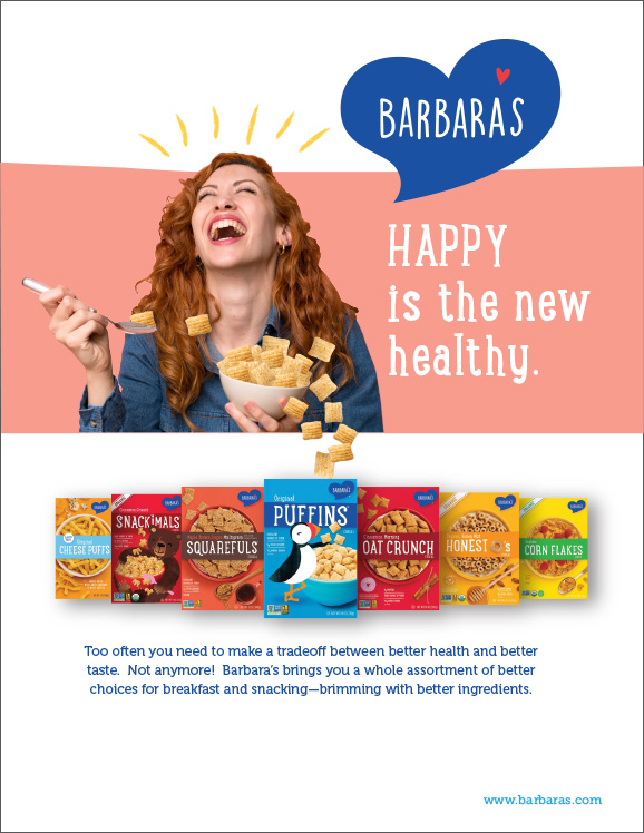
Barbara’s was known for it’s natural and organic health credentials – but it was time to double down on the other aspect that moms were looking for: yummy. Moms, kids and families can all enjoy (and even get excited about) eating Barbara’s products, and showcasing this energy and tone brought the brand to life in a whole new way.
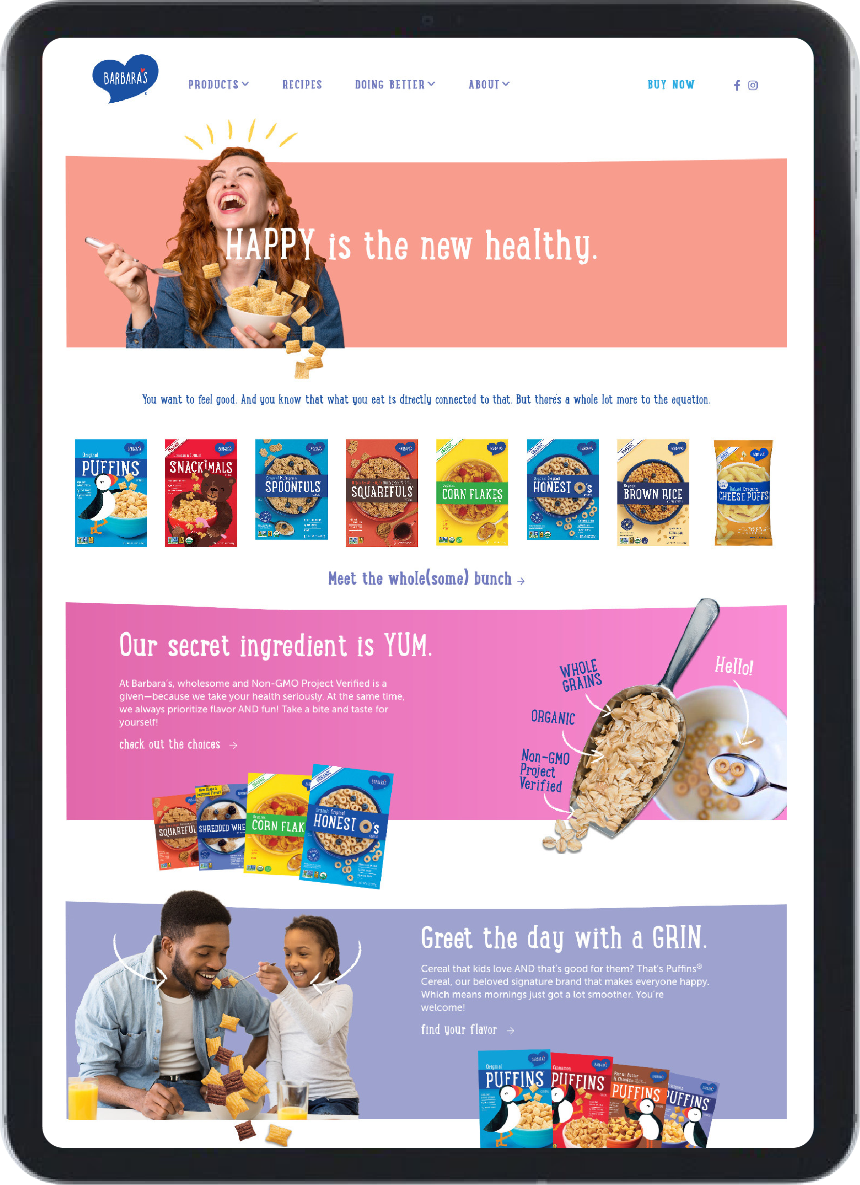
A foundation to believe in
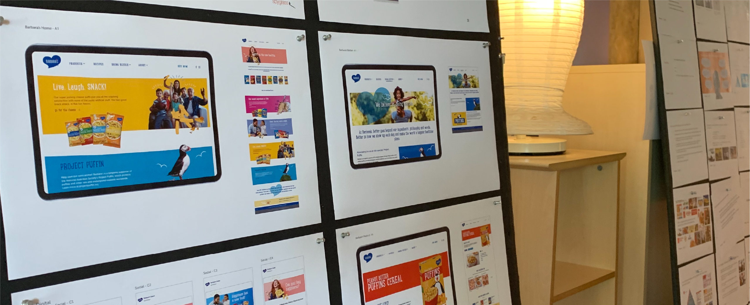
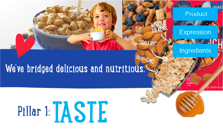
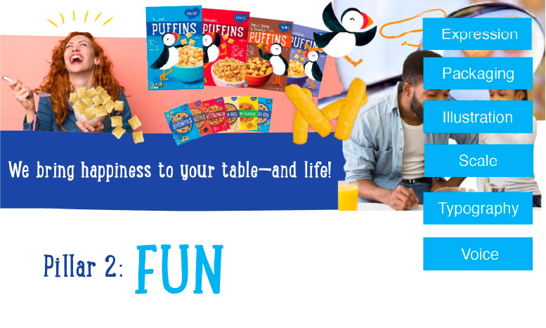
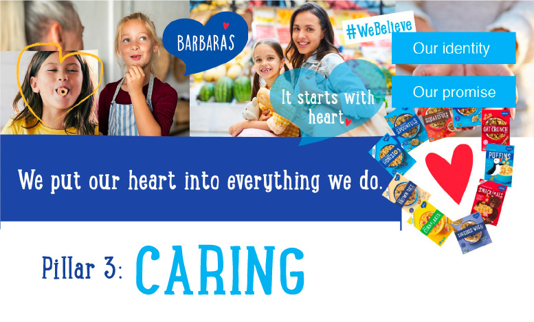
Spyglass got to the heart of what Barbara’s stands for. We then struck the right balance between the pillars of Taste, Fun and Caring to deliver a message that says to be a healthy family is more than a label on a box, it’s about making good choices together and having fun doing it.
Results
Strong brand and digital experience = Strong Results.
Since the website launch, the team has rolled out a comprehensive digital marketing campaign to drive users to the website. They are seeing success with this strategy and are continuing to launch new products into the market.
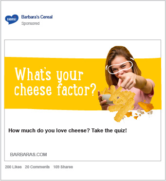
Barbara’s had a strong social media following leading up to the rebrand – so it was critical that these fans were one of the first to see the new Barbara’s look and feel.
Deliverables
- Brand Positioning, Story and Pillars
- Messaging
- Website
- Brand Guidelines
